FUNetix Reading App – Animated Training Video (EdTech Product Explainer)
Project Overview
FUNetix is an educational reading app developed by the American Youth Literacy Foundation, designed to help children learn to read using a science-based phonetic approach.
The goal of this project was to create an animated training video that clearly explains how the app works and how it should be used by parents, educators, and tutors. The video needed to balance instructional clarity with an engaging, friendly tone suitable for a broad, non-technical audience.
My Role
I led the visual concept, illustration, and animation for the training video, taking an early draft and evolving it into a cohesive, engaging instructional experience. I collaborated closely with the executive director and project manager to refine the visual direction, improve clarity, and ensure the final video aligned with both the educational goals and the product’s visual identity.
Process & Design Decisions
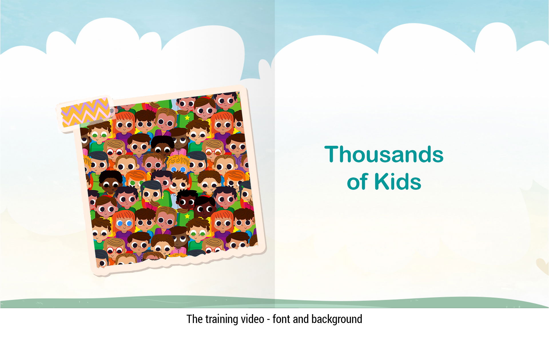
Visual Direction
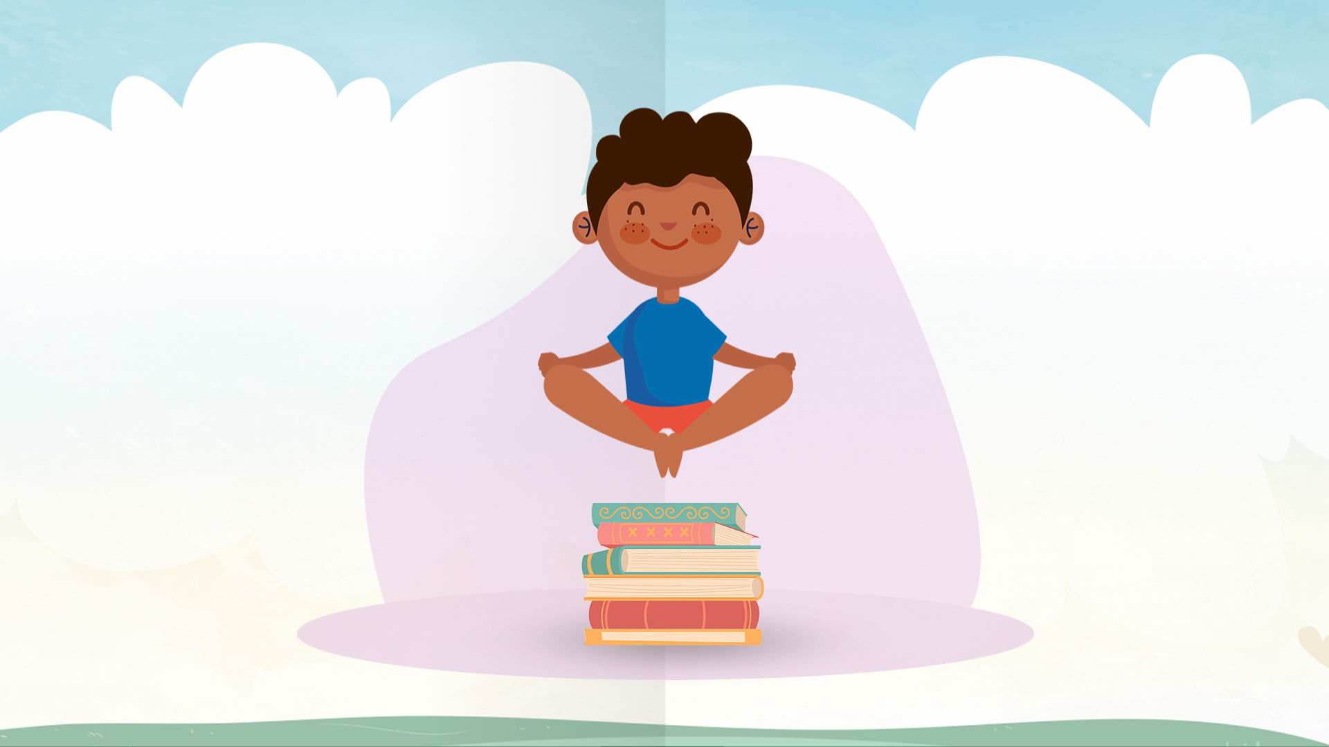
The initial version relied heavily on stock footage, which felt visually inconsistent and emotionally disconnected. I transitioned the project toward a custom illustration-based approach to establish a cohesive visual language, allow for clearer storytelling, and better support abstract phonetic concepts.
Illustration System
I designed a flexible illustration system that could support multiple learning scenarios while remaining visually consistent. This allowed the video to feel approachable and friendly while still communicating instructional content clearly.
Voiceover & Visual Alignment
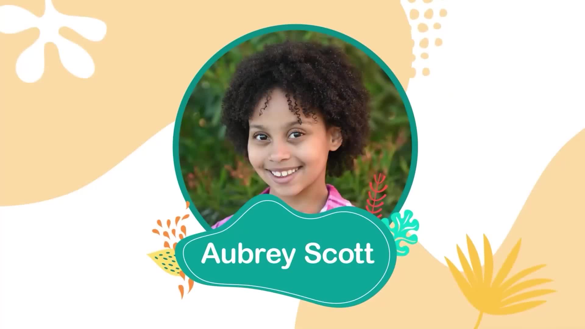
Because the voiceover opens with “Hi, I’m Aubrey Scott,” one of FUNetix’s child ambassadors, I proposed introducing her visually at the start of the video. Showing her image helped viewers immediately connect the voice to a real person, building familiarity and trust from the first moments of the training.
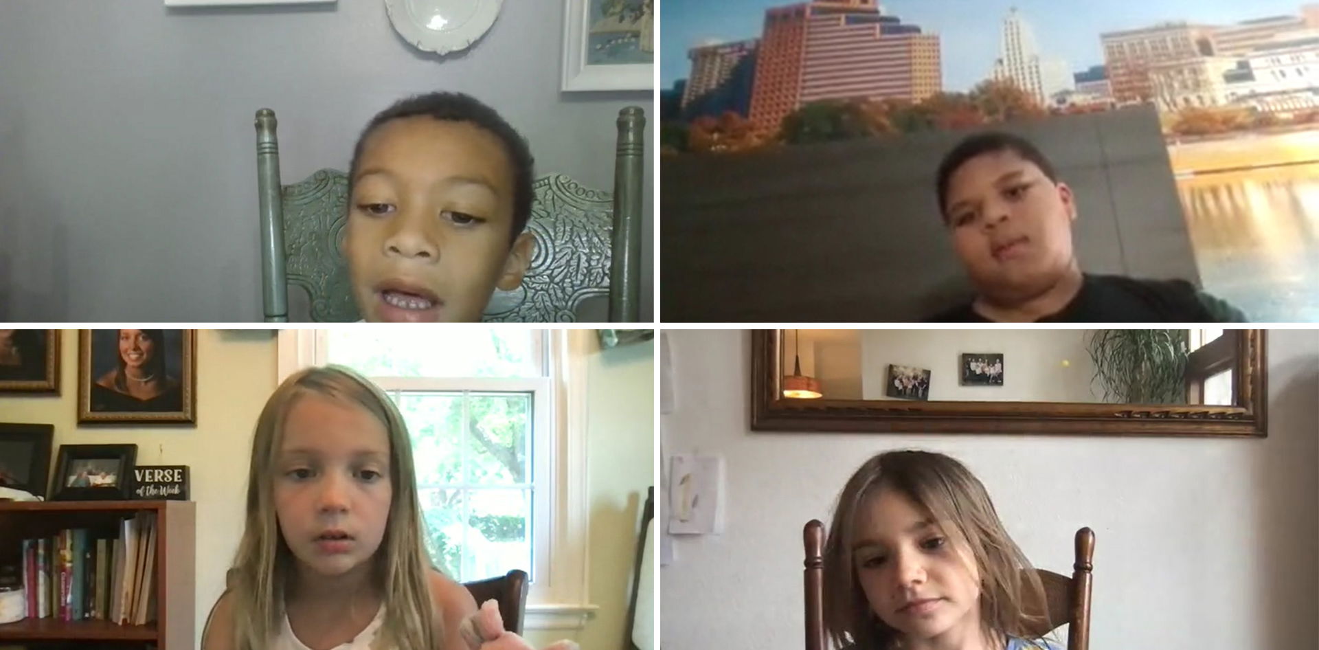
Standardizing Demo Footage
Some demonstration clips were recorded by parents using different devices and varied widely in quality. To solve this, I created a visual template system that standardized backgrounds, framing, and transitions. This significantly improved visual consistency and reduced distraction for viewers.
Challenges & Solutions
Challenge 1: Reliance on Stock Video
The first version relied heavily on stock footage. Finding clips that captured the nuanced emotions and interactions we wanted was surprisingly difficult. Generic scenes felt inauthentic, and sourcing diverse characters was limited.
Solution: I strategically shifted to illustrations for the final video. Illustrations gave me a flexible canvas where I could tweak every detail—expressions, body language, clothing styles—and even create entirely new elements to perfectly convey the intended message.
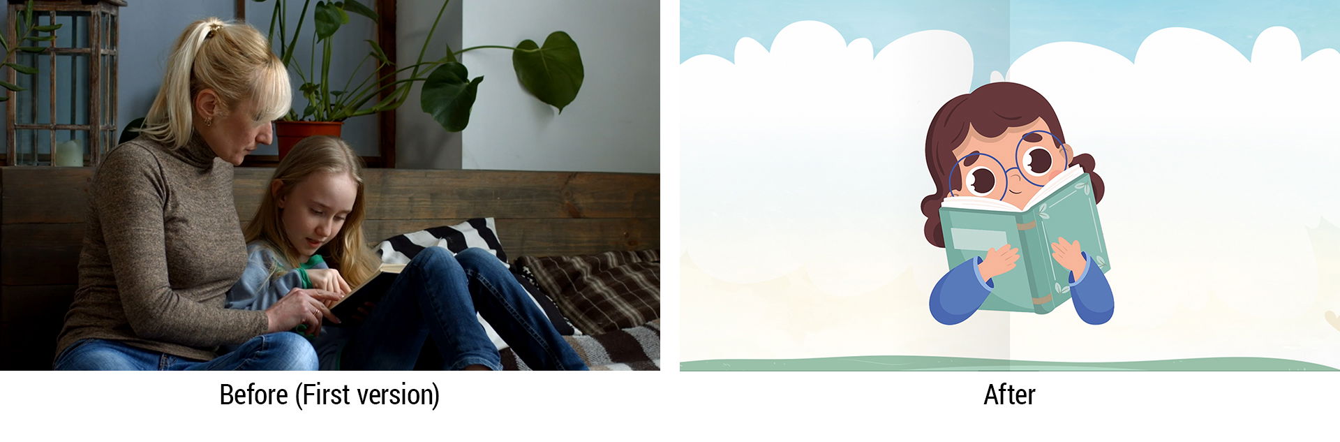
Challenge 2: Lack of Visual Cohesion
The existing stock videos didn’t match the app’s overall visual style, which made the video feel disconnected from the product experience.
Solution: I replaced stock footage with illustrations that aligned with the app’s existing illustration aesthetic. This not only strengthened visual cohesion but also enhanced the video’s impact and reinforced the brand’s overall style.
Challenge 3: Background, Font, and Animation Consistency
To create a seamless introduction to the FUNetix app, maintaining visual consistency was essential. Viewers needed an experience that felt familiar and aligned with the app’s design.
Solution: I used a consistent background throughout the training video, reflecting the app’s familiar style. I also established cohesive font choices, color schemes, and animation styles, carefully managing transitions and timing to create a smooth, polished visual narrative.
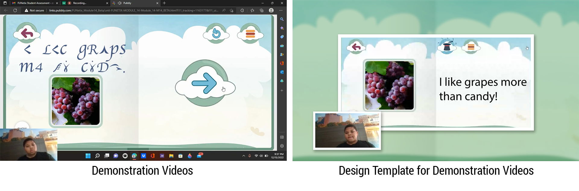
Challenge 4: Maintaining Visual Harmony in Demonstration Videos
The demonstration videos were recorded by children’s parents, resulting in varied video quality and inconsistent recording environments—different rooms, lighting conditions, and screen captures made it hard to maintain visual consistency.
Solution: I created and applied a design template to unify the look and feel across all demonstration videos, ensuring both visual consistency and efficient production while preserving the authenticity of children interacting with the app.
Challenge 5: Avoiding Background Conflicts Between Training and Demonstration Videos
Because the training video shares the same background design as the app, app backgrounds in demonstration videos risked overlapping visually, which could confuse viewers.
Solution: I applied subtle modifications to the demonstration video backgrounds—using blurring and a green filter—within the design template. This preserved the training video’s visual consistency while maintaining familiarity with the app environment, resulting in a cohesive and visually clear experience.
Challenge 6: Enhancing Viewer Engagement
The first version lacked sound effects, which made it harder to capture and hold viewers’ attention.
Solution: I added carefully chosen sound effects synced to the visuals. This strengthened emotional engagement, drew viewers into the story, and made the content feel more immersive and lively.

My Suggestions
I recommended script adjustments to ensure the language was inclusive and accessible to all users. For example, the original line:
“Unlike many phonics curricula that use silly, nonsensical stories like "the cat sat on the mat," FUNetix brings common, everyday language immediately within the reach of young children that describes the world around them.”
could potentially alienate users familiar with other phonics programs. I suggested revising it to:
“Unlike ALL other phonics curricula that are forced to use simple, decodable words and sight words like "the cat sat on the mat," FUNetix brings common, everyday language immediately within the reach of young children that describes the world around them.”
The team agreed, and the script was updated, making the content more inclusive and engaging for the full audience.
Outcome
The final training video delivered a clear, engaging introduction to the FUNetix app, improving usability comprehension for parents and educators while maintaining a friendly, approachable tone. The illustration system and visual templates also created a foundation for future educational content.
Tools
After Effects, Illustrator, Photoshop, Media Encoder
Key Takeaways
- Consistency matters: Establishing visual templates and illustration standards early ensures cohesion across demonstration videos, regardless of source quality.
- Inclusive storytelling: Script and language choices can significantly affect accessibility and engagement; thoughtful iteration leads to more inclusive messaging.
- Sound enhances engagement: Matching sound effects to visuals strengthens viewer attention, emotional connection, and overall comprehension.
- Flexible design approach: Switching from stock video to illustrations allowed full control over style, character diversity, and brand alignment, reinforcing clear communication.
- Document and guide: Providing clear templates and notes for external contributors (e.g., voice-over, demo videos) prevents inconsistencies and ensures quality without overburdening volunteers.