BRAND IDENTITY & VISUAL SYSTEMS
Eagle Promotions — Brand Identity System [Brand identity · Concept design · Social campaigns]
I designed the Eagle Promotions logo around the idea of transformation. As a company producing promotional products—from t-shirts and mugs to tote bags—Eagle Promotions turns blank materials into useful brand expressions. Inspired by origami, the logo uses polygonal line work to suggest how a single sheet can be thoughtfully folded into many forms, symbolizing flexibility, craftsmanship, and creative potential. The geometric eagle mark reflects this process of shaping raw materials into impactful products, while maintaining a clean and adaptable visual system. I extended the identity into social media visuals that reinforced the brand’s structured yet creative character.
X Branding — Brand Identity System [Brand identity · Concept design · Social campaigns]
I created a flexible brand identity system for X Branding centered on the idea “Find Your X,” a framework for defining what makes each brand unique. The work included logo design, tagline development, typography, color palette, and brand guidelines, with motion and animation styles extending the identity beyond static use. I introduced the concept of treating “X” as a variable, allowing its visual form to adapt across luxury, entertainment, sports, and wellness contexts while preserving a cohesive system. To demonstrate this flexibility, I developed social media campaign concepts tailored to each industry’s audience, tone, and visual language.
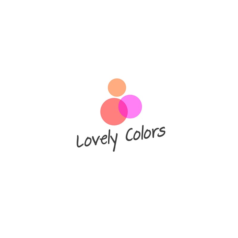
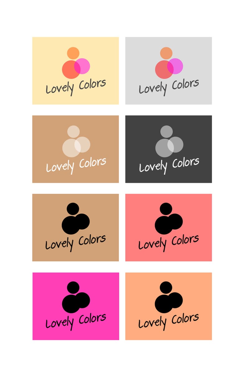
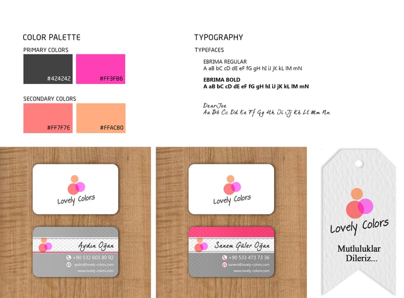
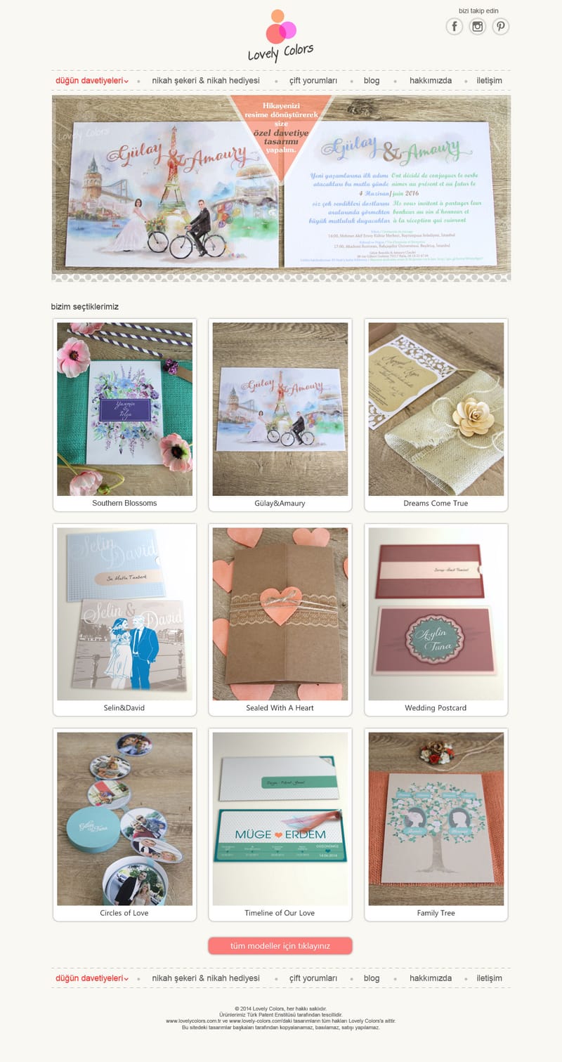
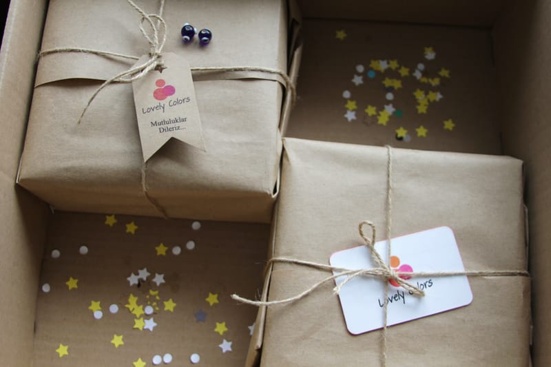
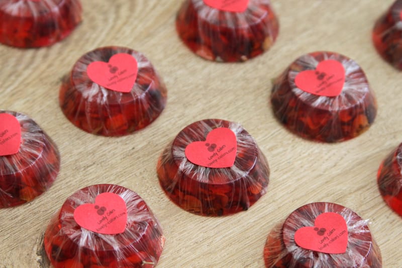
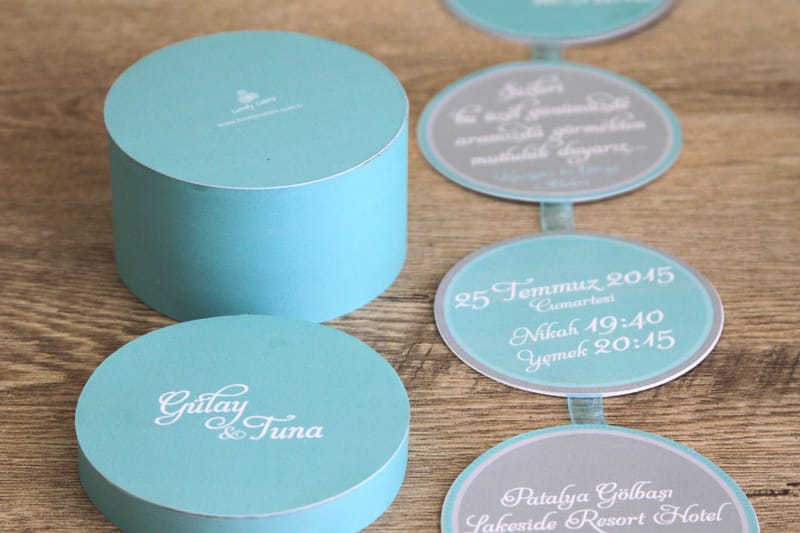
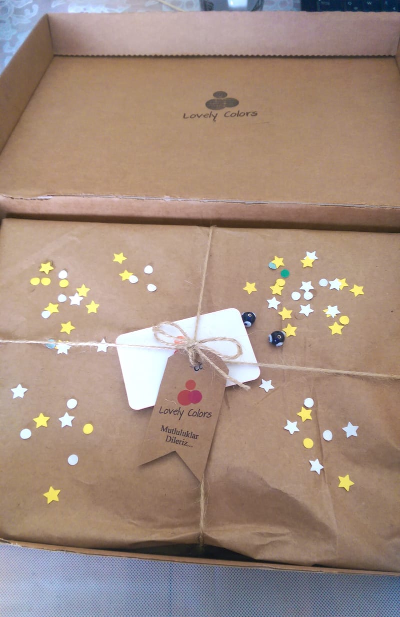
Lovely Colors — Brand Identity & Print Production System
Founded and developed the Lovely Colors brand, designing the full identity system including logo, stationery, packaging elements, and bespoke wedding invitation collections. Led projects from concept through print production, managing vendor coordination and ensuring material and layout precision across physical deliverables.
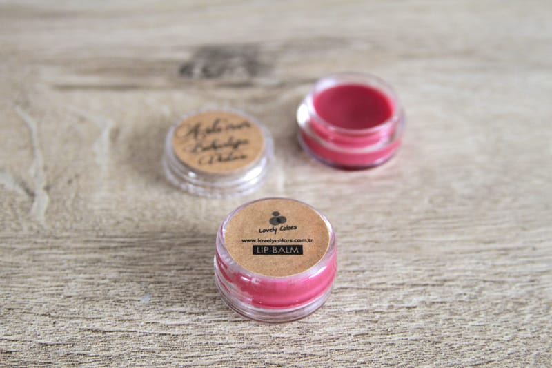

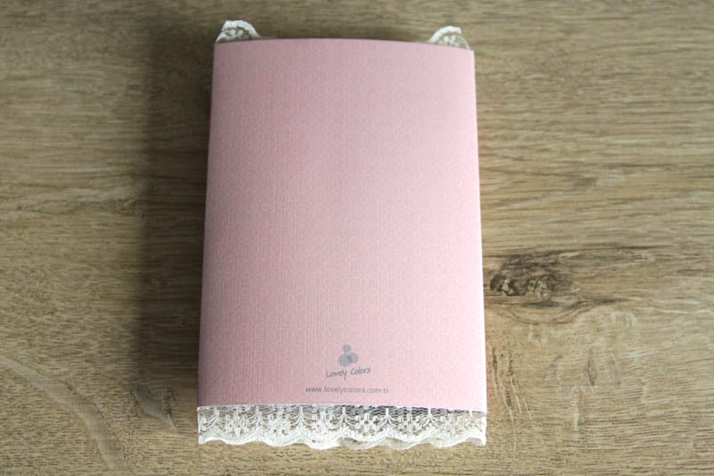

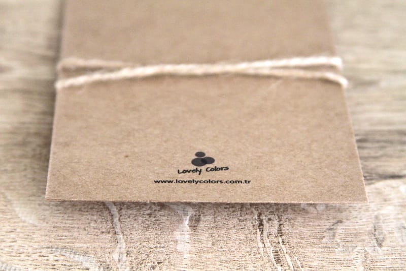

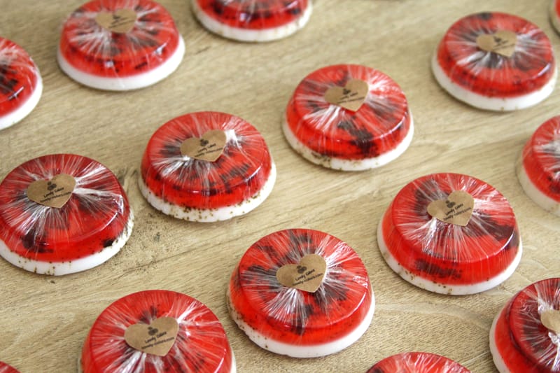
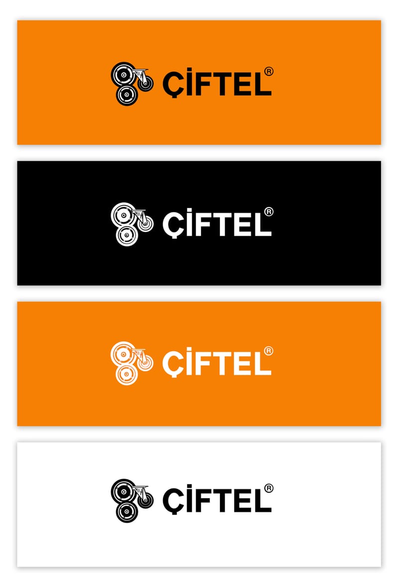
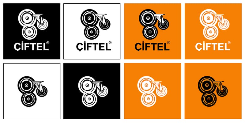
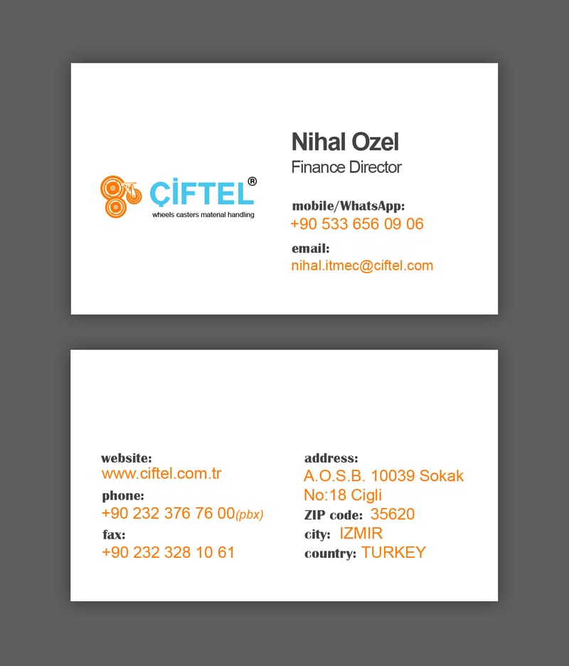
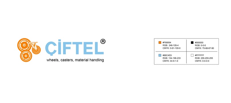
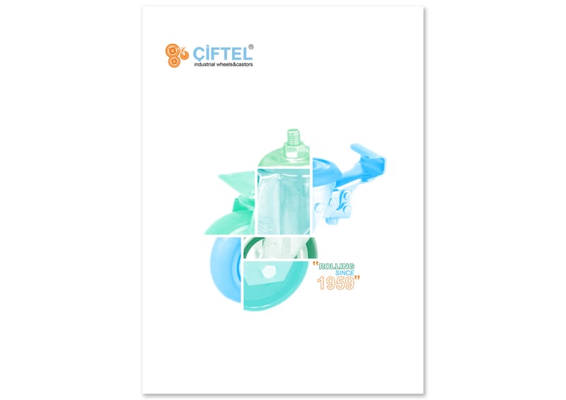
Ciftel — Brand Simplification & System Refresh
Led a strategic logo simplification and brand refresh for Ciftel, modernizing the identity while maintaining visual continuity for existing customers. Refined the color system and applied the updated identity across print materials including brochures and posters to ensure cohesive brand presence across touchpoints.


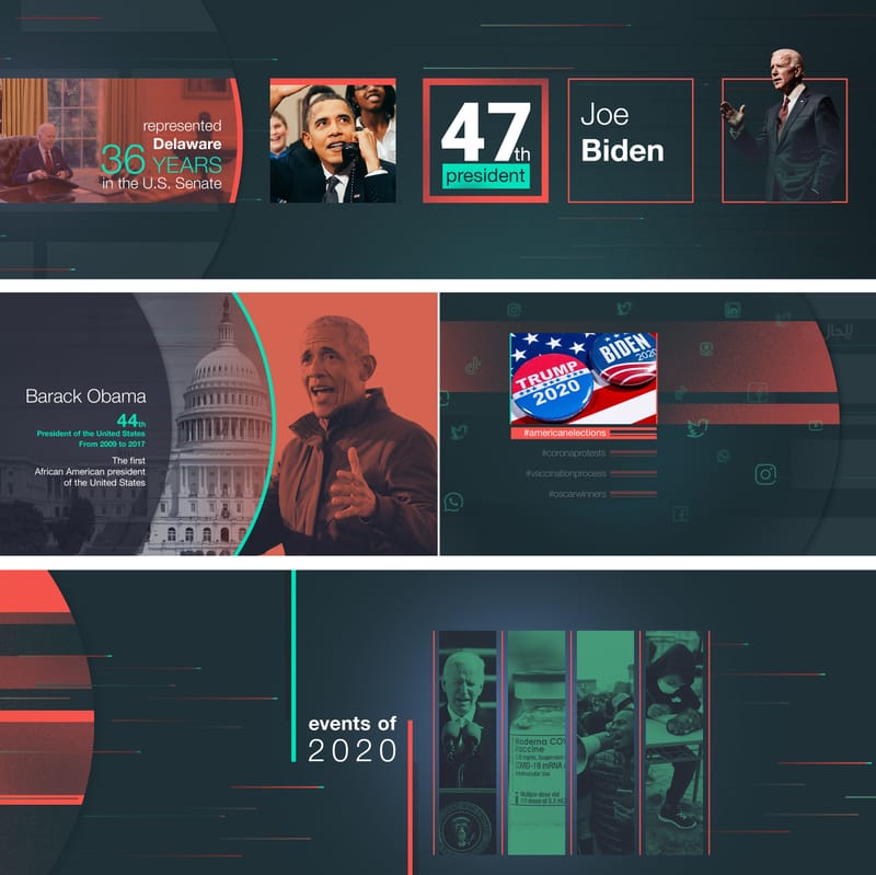
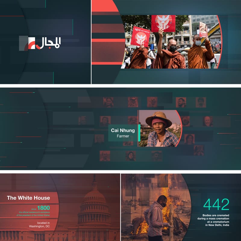
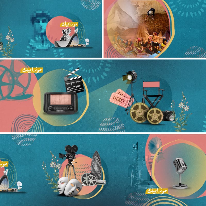
TV shows
![Eagle Promotions — Brand Identity System [Brand identity · Concept design · Social campaigns]](https://files.cdn-files-a.com/uploads/8380203/800_697c505a01968.jpg)
![Eagle Promotions — Brand Identity System [Brand identity · Concept design · Social campaigns]](https://files.cdn-files-a.com/uploads/8380203/2000_697c505a17451-thumbnail.jpg)
![Eagle Promotions — Brand Identity System [Brand identity · Concept design · Social campaigns]](https://files.cdn-files-a.com/uploads/8380203/800_697c505a1918b.jpg)
![Eagle Promotions — Brand Identity System [Brand identity · Concept design · Social campaigns]](https://files.cdn-files-a.com/uploads/8380203/800_697c505a04877.jpg)
![Eagle Promotions — Brand Identity System [Brand identity · Concept design · Social campaigns]](https://files.cdn-files-a.com/uploads/8380203/800_697c505a066c5.jpg)
![Eagle Promotions — Brand Identity System [Brand identity · Concept design · Social campaigns]](https://files.cdn-files-a.com/uploads/8380203/800_697c505a1af78.png)
![Eagle Promotions — Brand Identity System [Brand identity · Concept design · Social campaigns]](https://files.cdn-files-a.com/uploads/8380203/800_697c505a1cd46.png)
![Eagle Promotions — Brand Identity System [Brand identity · Concept design · Social campaigns]](https://files.cdn-files-a.com/uploads/8380203/800_697c505a1e627.png)
![Eagle Promotions — Brand Identity System [Brand identity · Concept design · Social campaigns]](https://files.cdn-files-a.com/uploads/8380203/800_697c505a21874.png)
![Eagle Promotions — Brand Identity System [Brand identity · Concept design · Social campaigns]](https://files.cdn-files-a.com/uploads/8380203/800_697c505a1ffad.png)
![Eagle Promotions — Brand Identity System [Brand identity · Concept design · Social campaigns]](https://files.cdn-files-a.com/uploads/8380203/800_697c505a0dbb2.png)
![Eagle Promotions — Brand Identity System [Brand identity · Concept design · Social campaigns]](https://files.cdn-files-a.com/uploads/8380203/800_697c505a0f9c5.png)
![Eagle Promotions — Brand Identity System [Brand identity · Concept design · Social campaigns]](https://files.cdn-files-a.com/uploads/8380203/800_697c505a22e2f.png)
![Eagle Promotions — Brand Identity System [Brand identity · Concept design · Social campaigns]](https://files.cdn-files-a.com/uploads/8380203/800_697c505a156a0.png)
![Eagle Promotions — Brand Identity System [Brand identity · Concept design · Social campaigns]](https://files.cdn-files-a.com/uploads/8380203/800_697c505a136bd.png)
![Eagle Promotions — Brand Identity System [Brand identity · Concept design · Social campaigns]](https://files.cdn-files-a.com/uploads/8380203/800_697c505a083ff.jpg)
![Eagle Promotions — Brand Identity System [Brand identity · Concept design · Social campaigns]](https://files.cdn-files-a.com/uploads/8380203/800_697c505a0bdf0.jpg)
![Eagle Promotions — Brand Identity System [Brand identity · Concept design · Social campaigns]](https://files.cdn-files-a.com/uploads/8380203/800_697c505a0a122.jpg)
![X Branding — Brand Identity System [Brand identity · Concept design · Social campaigns]](https://files.cdn-files-a.com/uploads/8380203/800_67a44fc5425ca.png)
![X Branding — Brand Identity System [Brand identity · Concept design · Social campaigns]](https://files.cdn-files-a.com/uploads/8380203/800_67a44fc5425cb.png)
![X Branding — Brand Identity System [Brand identity · Concept design · Social campaigns]](https://files.cdn-files-a.com/uploads/8380203/800_67a44fc52e9e2.png)
![X Branding — Brand Identity System [Brand identity · Concept design · Social campaigns]](https://files.cdn-files-a.com/uploads/8380203/800_67a44fc61716e.png)
![X Branding — Brand Identity System [Brand identity · Concept design · Social campaigns]](https://files.cdn-files-a.com/uploads/8380203/800_67a44fc52fdf8.png)
![X Branding — Brand Identity System [Brand identity · Concept design · Social campaigns]](https://files.cdn-files-a.com/uploads/8380203/800_67a452da18498.png)
![X Branding — Brand Identity System [Brand identity · Concept design · Social campaigns]](https://files.cdn-files-a.com/uploads/8380203/800_67a452da63e25.png)
![X Branding — Brand Identity System [Brand identity · Concept design · Social campaigns]](https://files.cdn-files-a.com/uploads/8380203/800_67a452dd3cdc5.png)
![X Branding — Brand Identity System [Brand identity · Concept design · Social campaigns]](https://files.cdn-files-a.com/uploads/8380203/800_67a452db18cc8.png)
![X Branding — Brand Identity System [Brand identity · Concept design · Social campaigns]](https://files.cdn-files-a.com/uploads/8380203/800_67a452db6fa67.png)
![X Branding — Brand Identity System [Brand identity · Concept design · Social campaigns]](https://files.cdn-files-a.com/uploads/8380203/800_67a452da80957.png)
![X Branding — Brand Identity System [Brand identity · Concept design · Social campaigns]](https://files.cdn-files-a.com/uploads/8380203/800_67a452dc184a7.png)
![X Branding — Brand Identity System [Brand identity · Concept design · Social campaigns]](https://files.cdn-files-a.com/uploads/8380203/800_67a452dc7a203.png)
![X Branding — Brand Identity System [Brand identity · Concept design · Social campaigns]](https://files.cdn-files-a.com/uploads/8380203/800_67a452dcd2d43.png)
![X Branding — Brand Identity System [Brand identity · Concept design · Social campaigns]](https://files.cdn-files-a.com/uploads/8380203/800_67a452dcb1b05.png)
![X Branding — Brand Identity System [Brand identity · Concept design · Social campaigns]](https://files.cdn-files-a.com/uploads/8380203/800_67a452dab3455.png)
![X Branding — Brand Identity System [Brand identity · Concept design · Social campaigns]](https://files.cdn-files-a.com/uploads/8380203/2000_67a4501e17ccf-thumbnail.jpg)
![X Branding — Brand Identity System [Brand identity · Concept design · Social campaigns]](https://files.cdn-files-a.com/uploads/8380203/2000_67a4501f7f128-thumbnail.jpg)