Showreel Opener (Motion Identity & Rhythm Study)
Project Overview
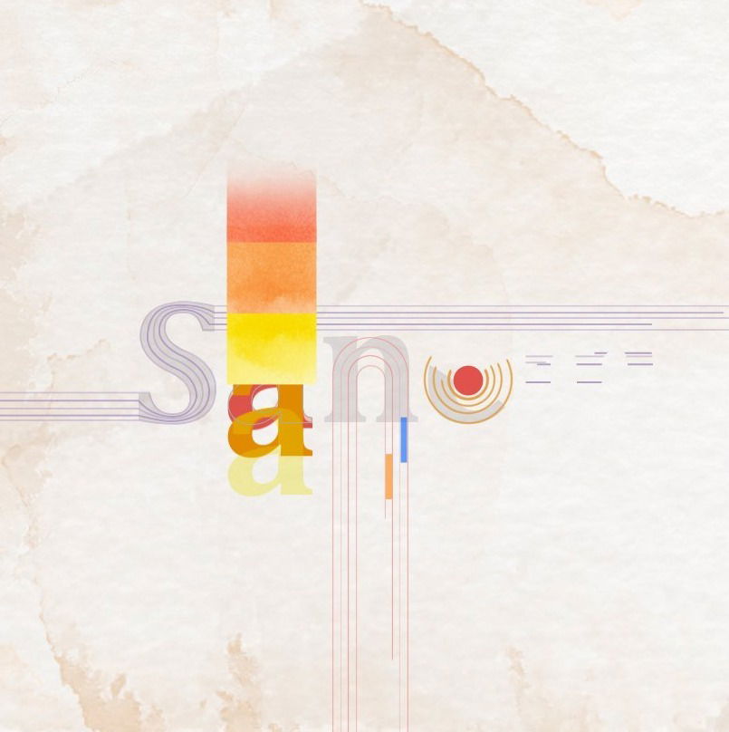
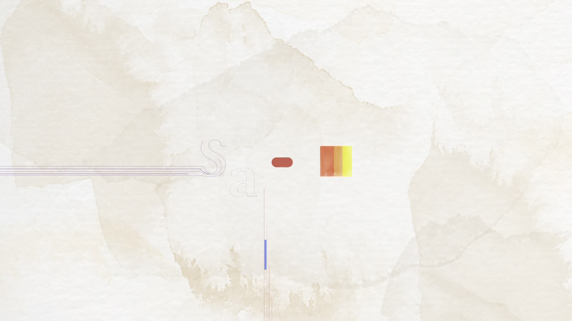
This piece was created as the opening title sequence for my motion design showreel, setting the visual and emotional tone before any project work appears.
Rather than functioning as a logo animation alone, the goal was to create a tactile, expressive moment that communicates how I think about motion, texture, and rhythm—anchoring the reel in something personal and intentional.
Design Decisions
Paper as a Foundation
Paper is more than a visual choice—it reflects how I think and work. With a background in print design and a long-standing preference for sketching and note-taking by hand, paper represents tactility, memory, and process. Incorporating paper textures brings a sense of realism and history into a digital medium, where subtle imperfections—creases, stains, grain—add depth and character.
Color, Rhythm & Personality
The vibrant shapes and energetic motion act as a counterpoint to the grounded texture of paper. Together, they reflect contrast: structure and play, precision and intuition. The motion pacing was designed to feel confident but human—introducing my work with warmth, energy, and a clear sense of personality.
Motion & Rhythm
The animation focuses on timing, transitions, and compositional flow rather than complexity. Motion rhythm was carefully tuned to feel intentional and inviting, creating a strong first impression without overwhelming the viewer.
My Role
- Concept Development: Defined the visual and emotional direction of the opener
- Motion Design & Animation: Designed and animated the full sequence
- Visual Identity Exploration: Used texture, color, and pacing to express personal motion language
Outcome
The final opener serves as a concise expression of my motion design approach—tactile, expressive, and rhythm-driven—setting the stage for the work that follows in the showreel.