Social Media Reels — Brand Launch Motion Series

Project Overview
This project included three promotional reels created for Marketing Hackers and published on their Instagram channel. The goal was to explain what the company does and why it matters within the limited attention window of social media.
The client provided scripts and voiceovers. I translated that content into a visual system focused on clarity, pacing, and accessibility, ensuring the message remained understandable even without sound.
Design & Motion Approach
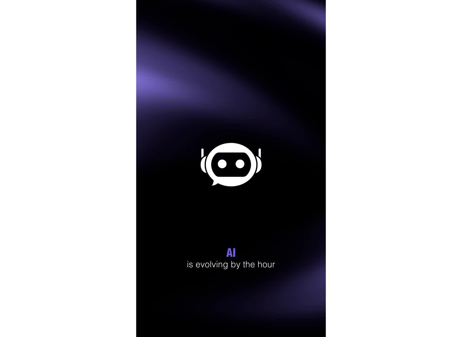
With a tight production timeline, I designed a simple, repeatable motion system using icons to directly reinforce the spoken message. This reduced cognitive load and allowed viewers to grasp key ideas quickly while scrolling.
Subtitles were used intentionally to support:
- viewers watching on mute
- non-native English speakers
- message clarity in fast-paced feeds
Color was treated as a functional tool rather than decoration. The animation was limited to white and purple on a black background, with purple used consistently to highlight key concepts in both text and motion. This created a clear visual hierarchy and reinforced brand recognition.
Constraints & Design Decisions
Time constraints required prioritizing:
- simplicity over visual complexity
- consistency over custom animation per scene
- clarity over stylistic experimentation
These choices enabled faster production while maintaining a cohesive and effective visual language across all three reels.
My Role & Responsibilities
- Motion Design & Animation: Designed and animated all motion sequences to clearly support the voiceover and guide attention within short social media timeframes.
- Visual System & Icon-Based Design: Created a simplified icon-based visual system to translate abstract marketing concepts into fast, easily scannable visuals.
- Accessibility-Focused Subtitling: Designed and timed subtitles to ensure message clarity for mute viewing, non-native speakers, and fast-scrolling social media users.
- Brand Color & Hierarchy Integration: Applied the brand’s purple color strategically to establish visual hierarchy and emphasize key ideas across text and motion.
- Sound Design & Timing: Integrated sound effects and pacing to reinforce transitions and maintain rhythm without overwhelming the core message.